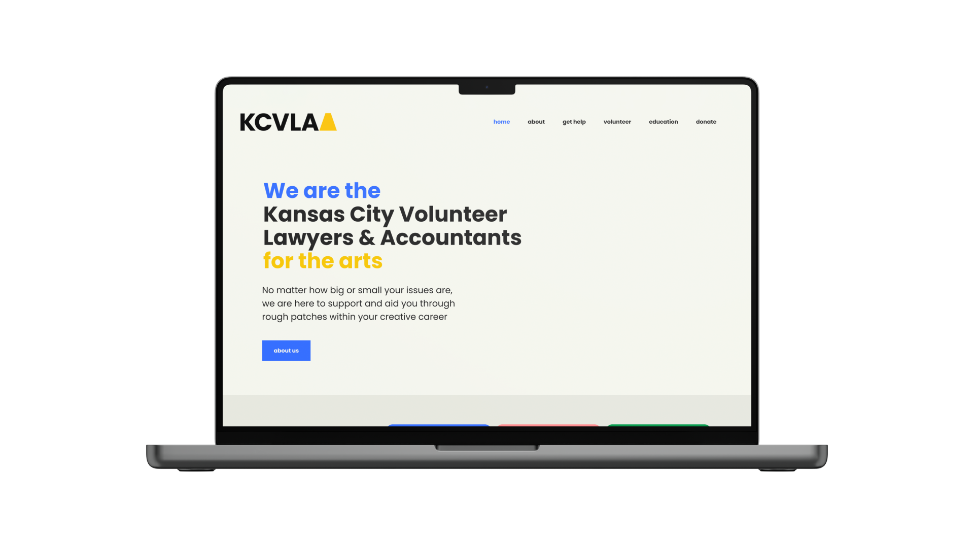
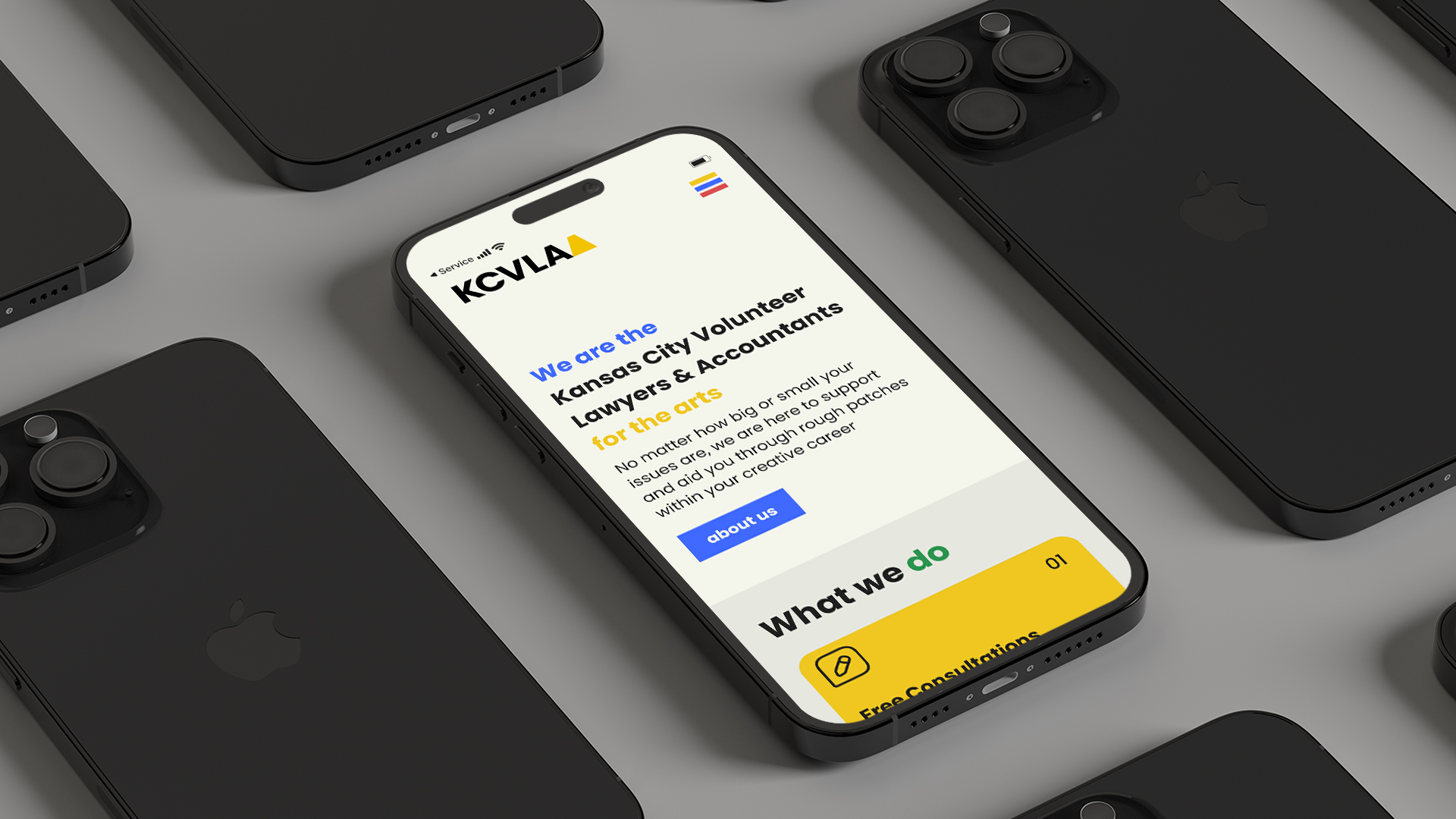
KCVLAA Website Redesign
8 weeks
As a team, we knew that creating a website for The Kansas City Volunteer Lawyers and Accounts for the Arts that truly connects with users requires more than just aesthetic appeal. So we rolled up our sleeves and got to work!
We spoke with clients, volunteers, current users, and even potential users to gather insights on what they need and want from a website like ours.
Armed with these valuable insights, we crafted a winning strategy that focuses on clarity, communication, and boosting user confidence. We then embarked on an exciting journey to redesign the KCVLAA website, making it more accessible and user-friendly than ever before.
Our goal was to create a website that not only looks professional but also tells a compelling story that resonates with the artist community. And we did just that! With a fresh new look, improved onboarding, and easy navigation, we’re confident that users will love the new KCVLAA website as much as we
loved creating it.
Skills
Design Research
User Research
Design Strategy
Wire Framing
Prototyping
Collaboration
Software
Adobe Illustrator
Adobe InDesign
Figma
SECTION ONE: RESEARCH
TASK ONE: Learn more about the client and their needs.
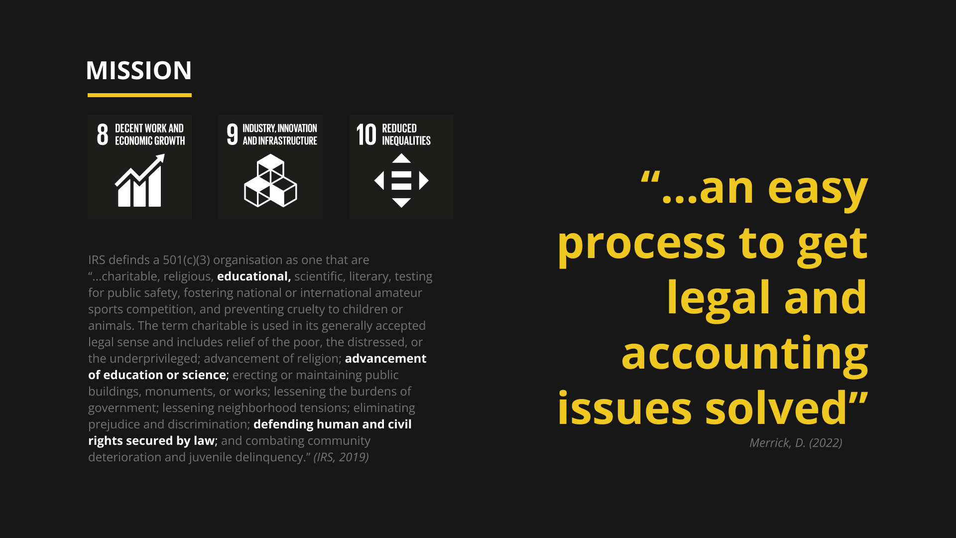
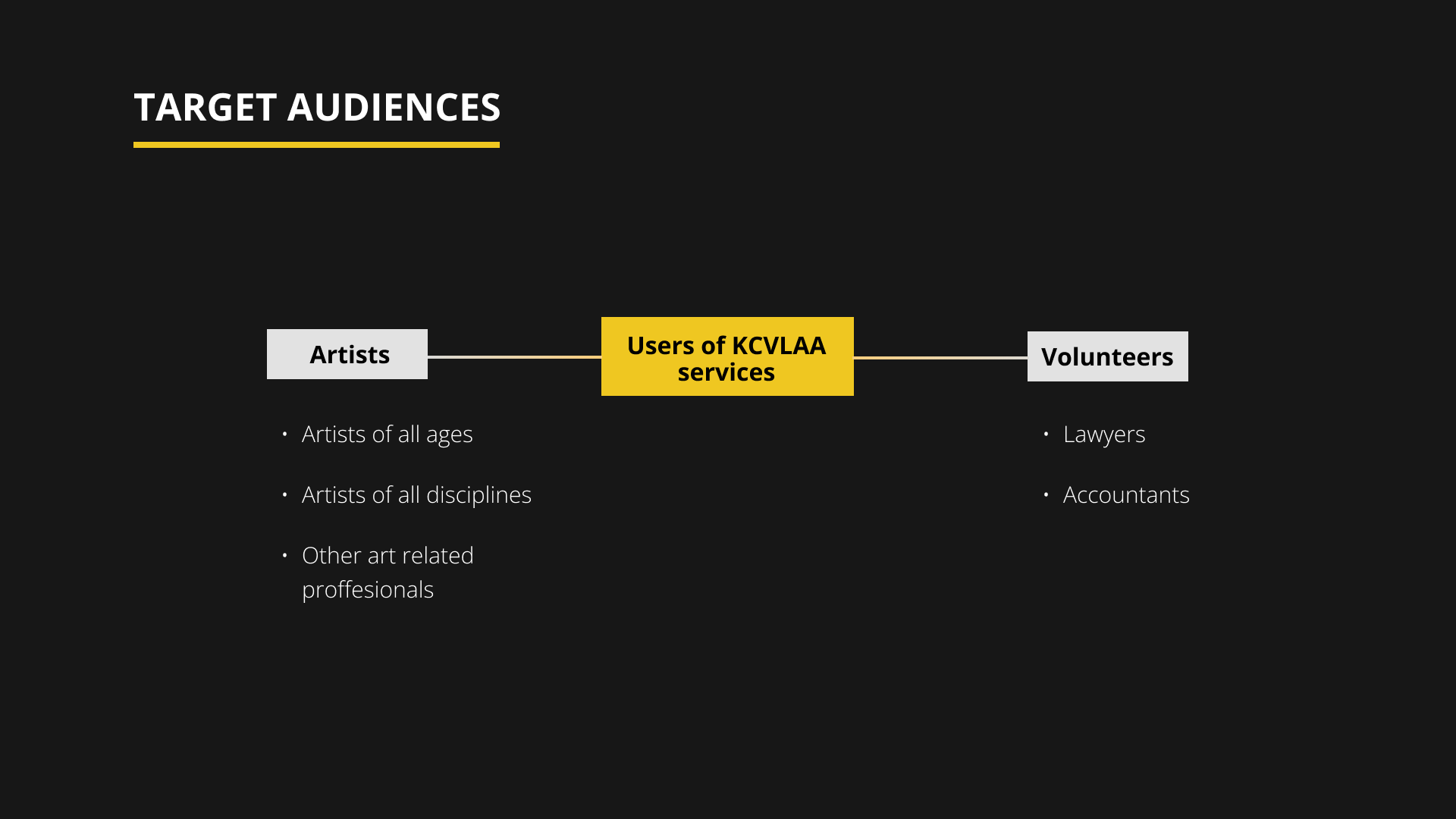
After having a conversation with the client, we dived in to find out more about the orgaisation and its existing website. From initial observation, the website was clearly in need of a redesign, however, we wanted to find out what we could do to make the site more accessible as this was a key issue brought up by the client. Thus, user research began!
TASK TWO: Conduct several methods of user research to uncover issues that need to be resolved.
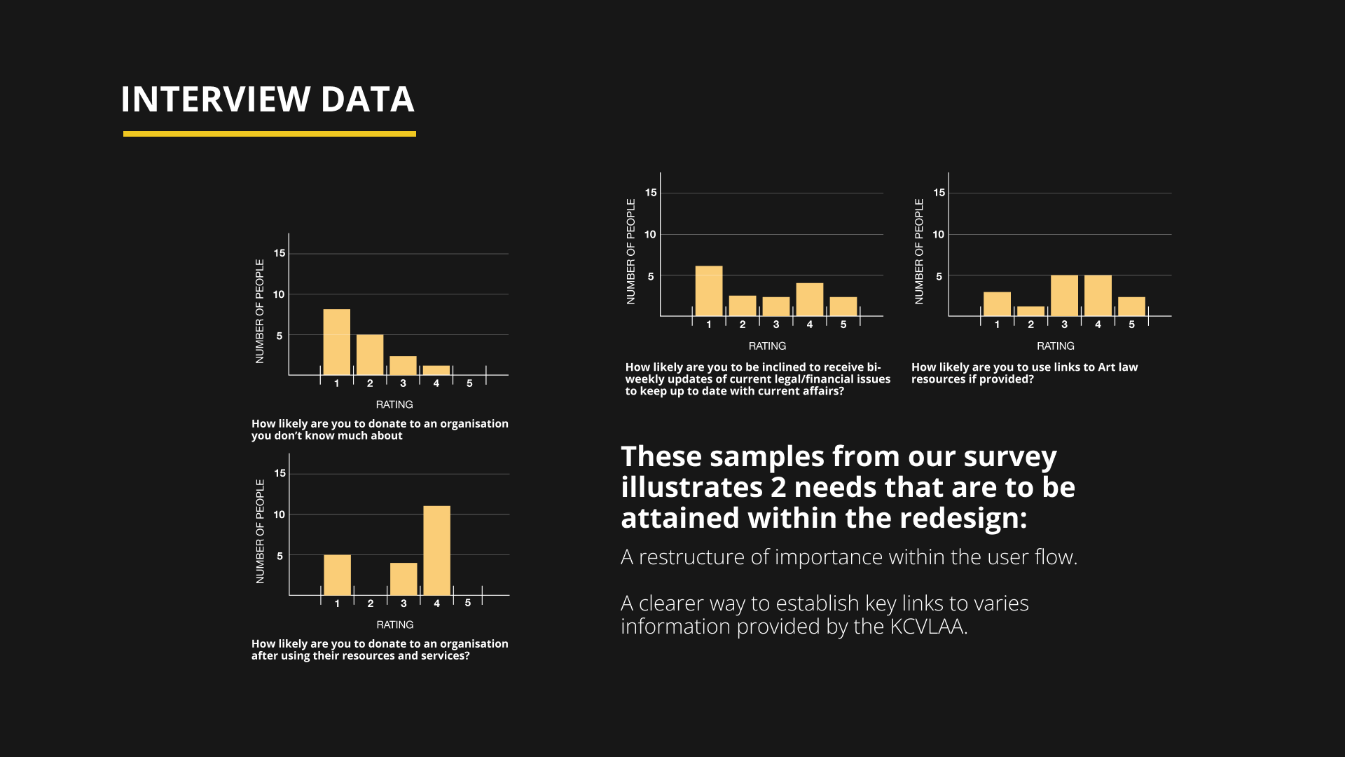
Group interview with Dave, a volunteer and board member at KCVLAA

CONCLUSION
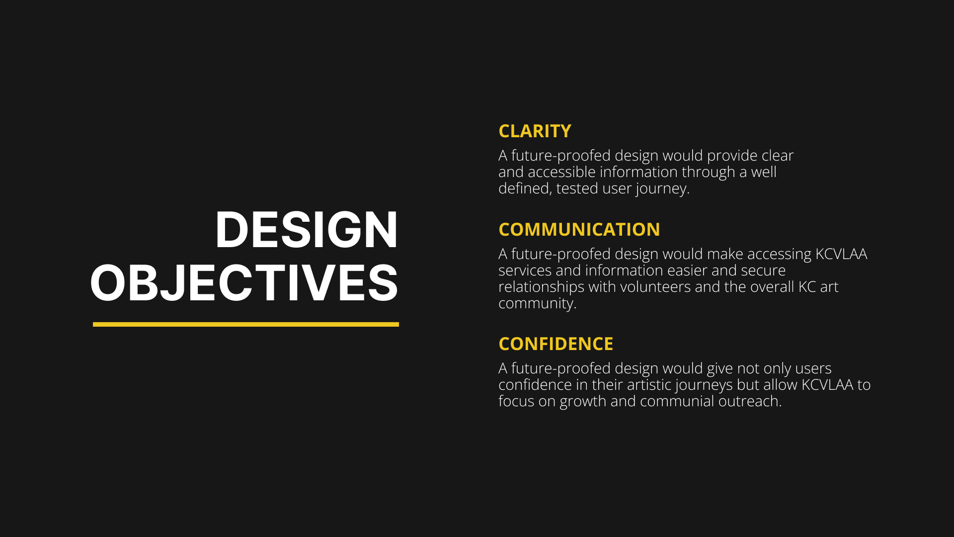
From our user research, this was our decided aim for the project.

SECTION TWO: DESIGN
PROBLEM #1: How can we improve clarity to establish an approachable design?
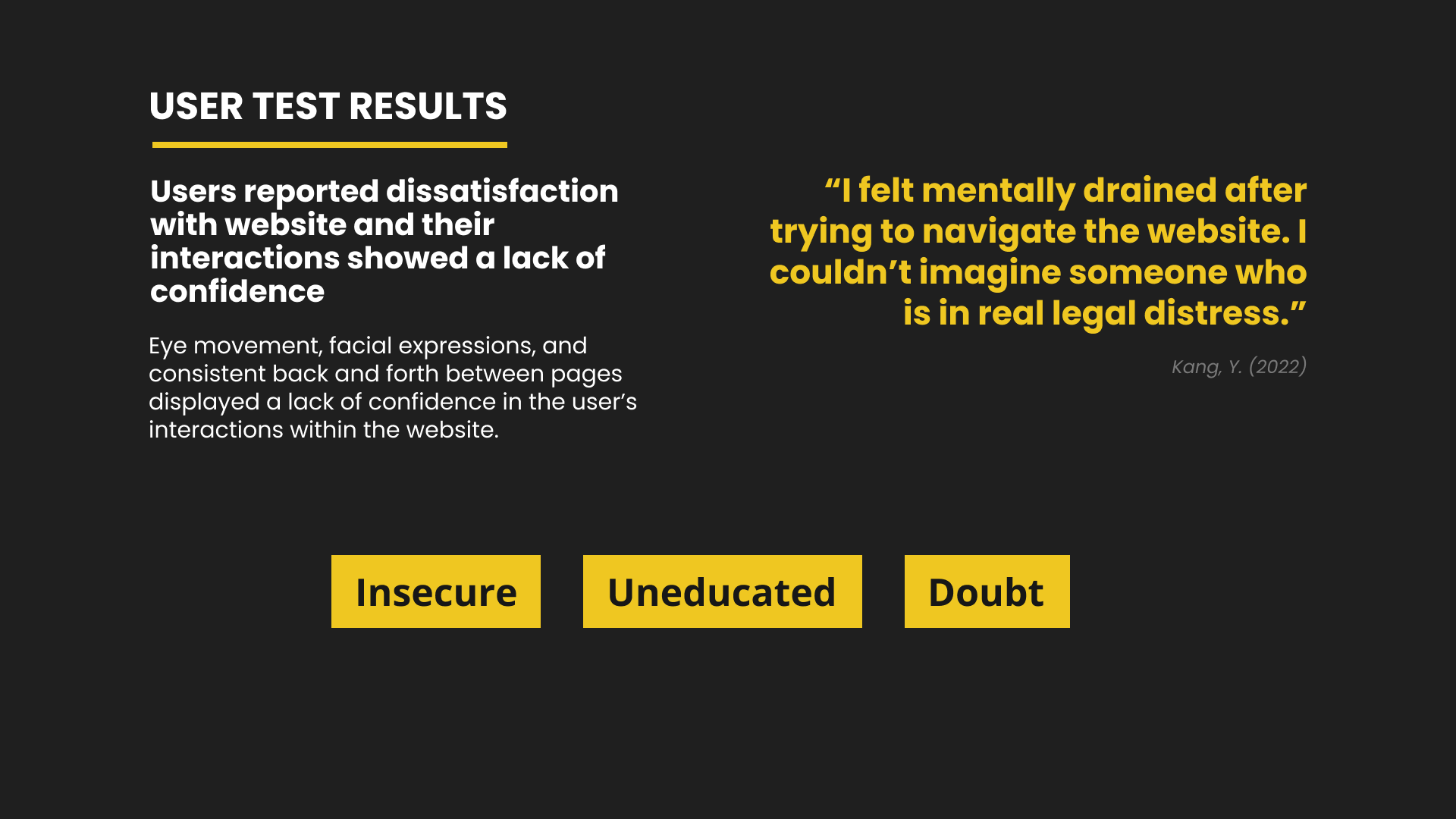
KCVLAA's existing website was determined confusing by our users during the usability test we conducted.
The old website had poor hierarchy issues and misleading navigation. Thus, we set out to see where these issues are and solve them.



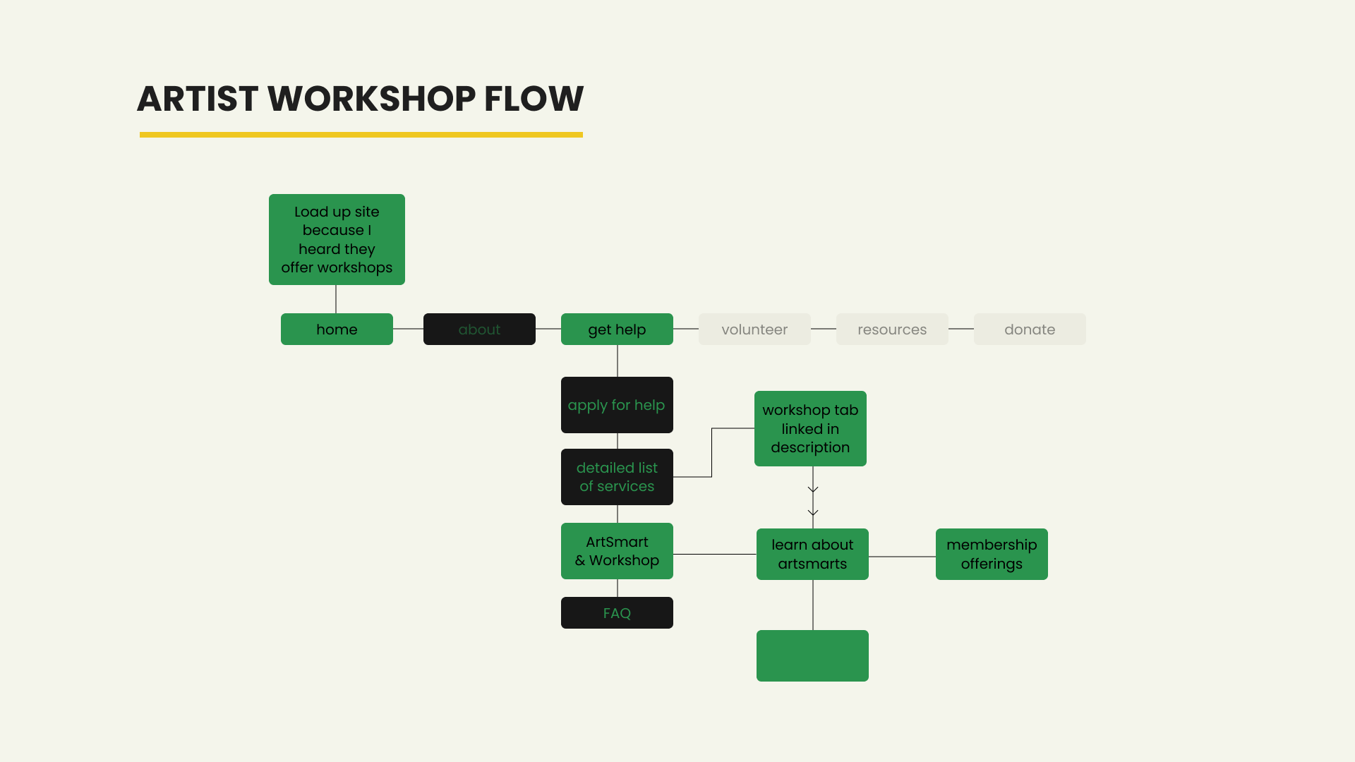
SOLUTION: Create a system that guides users at every touch point to allow for easy navigation.


Wireframes for Web Redesign


Design System

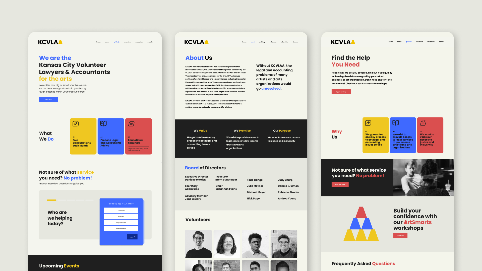
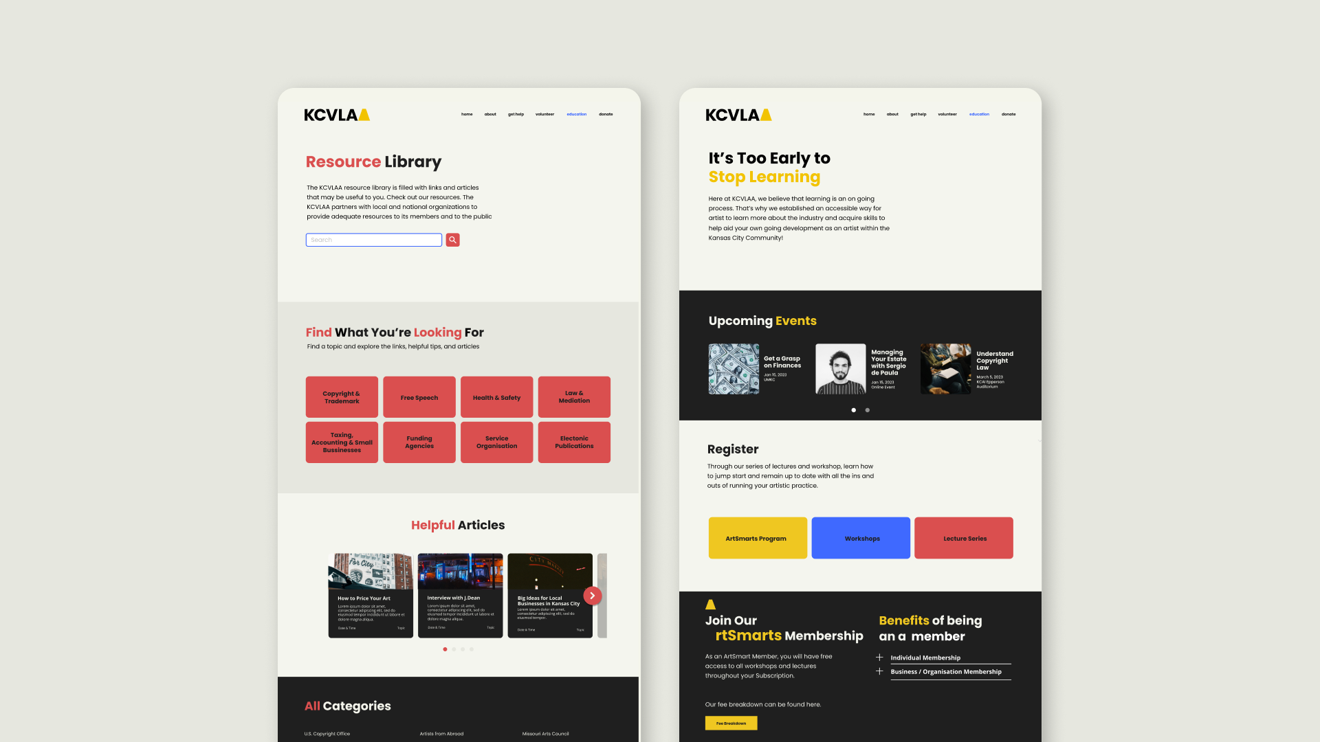

Old Header


PROBLEM #2: How can we create a system that makes communication between all users accessible?
From our interview with Dave, we found out that communication between all users that interact
with the website has issues with communication. This ranges from confusing language to
the Information gap between all parties of the website; this includes events and information hierarchy.
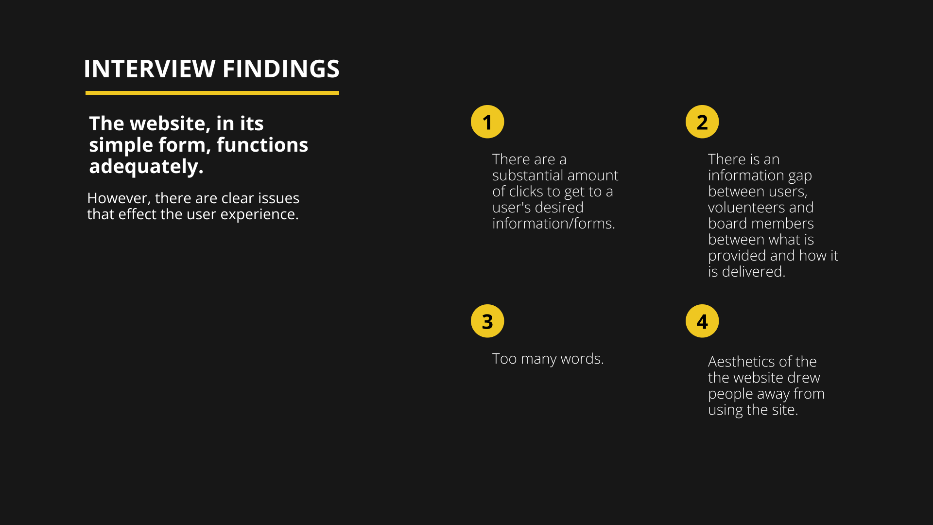
SOLUTION: Create a system that guides users at every touch point to allow for easy navigation.
As the lead copywriter of the website, we decided to go with a digestible structure to help users access information easier.
We did this with different interactions:
Exemplar Interaction One: Flash card-inspired decks that tell users what they need to know on each page.
Old Layout
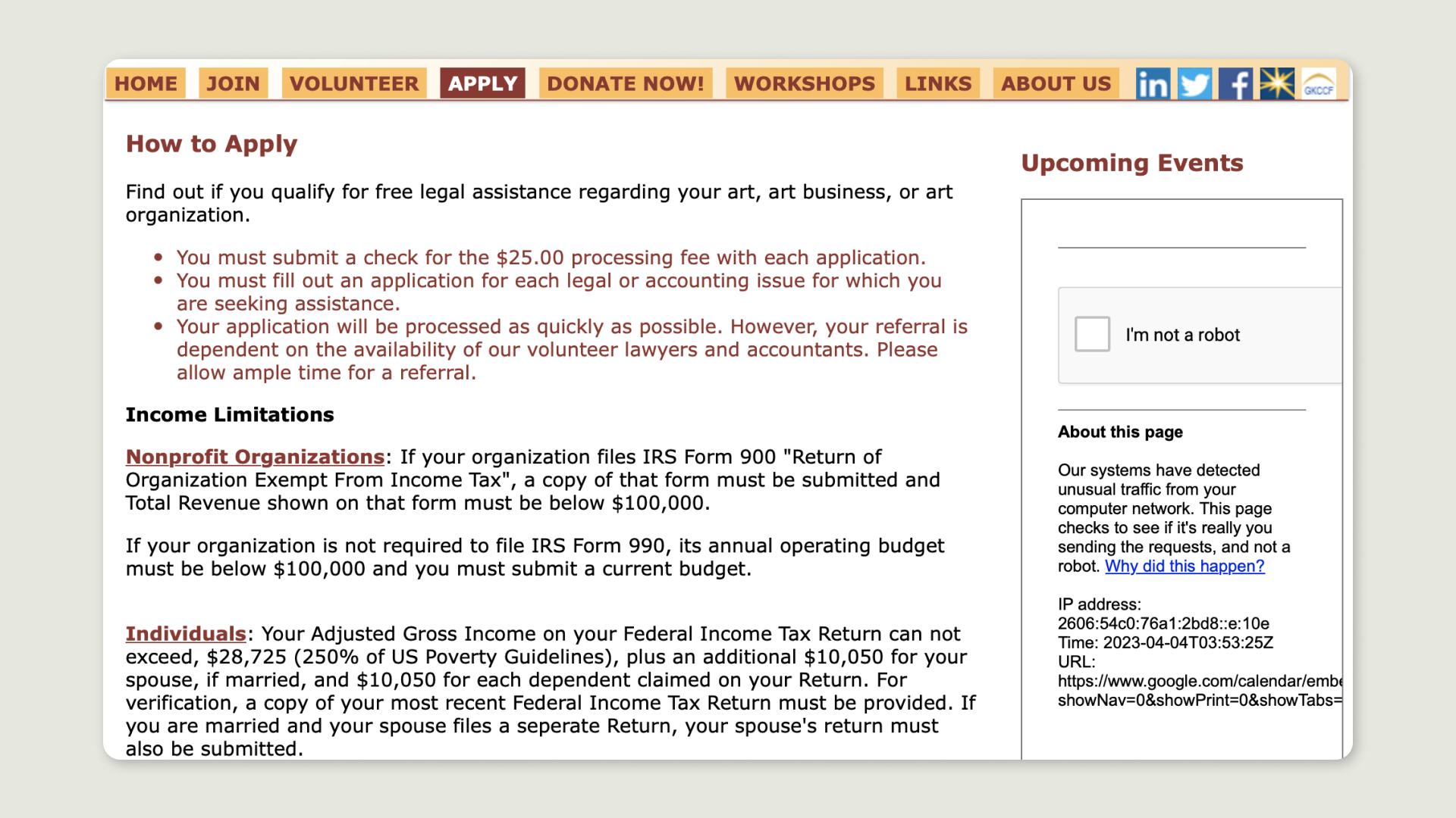
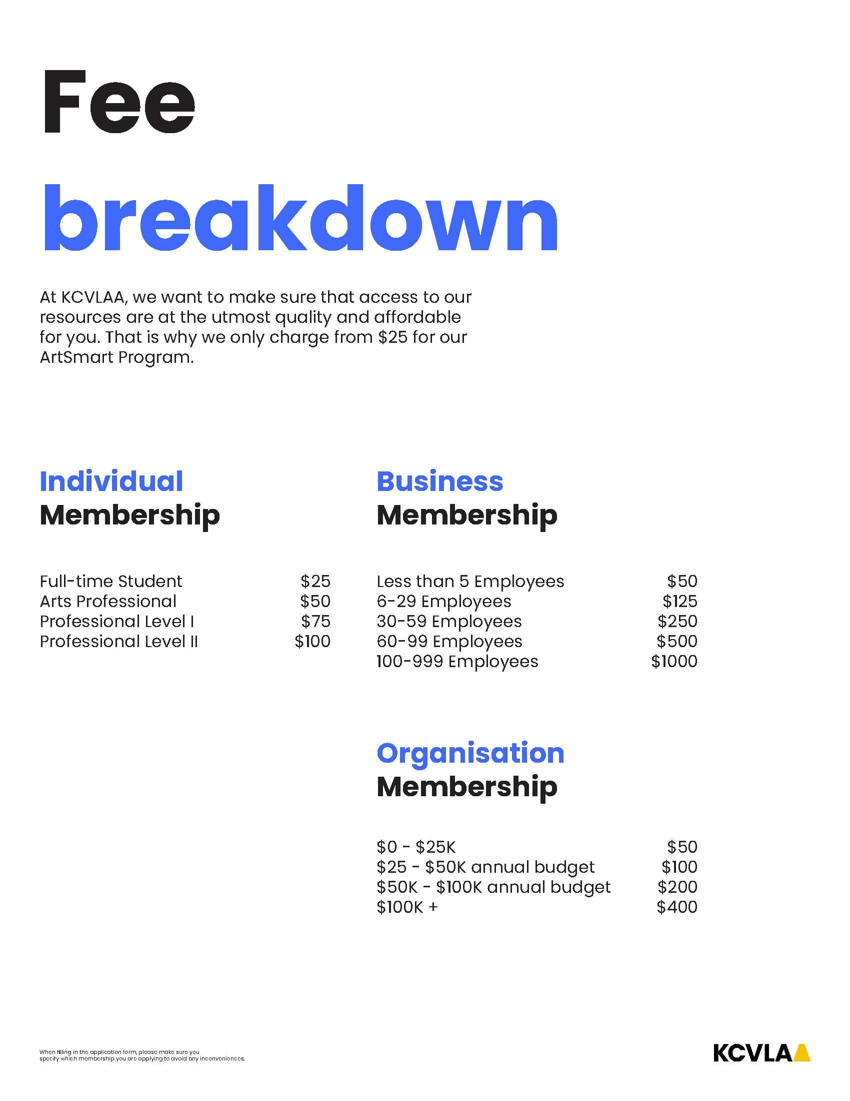
 Exemplar Interaction Three: Rewriting content to make the information more understandable such as a new fee breakdown.
PROBLEM #3: How can we increase user confidence while navigating the website?
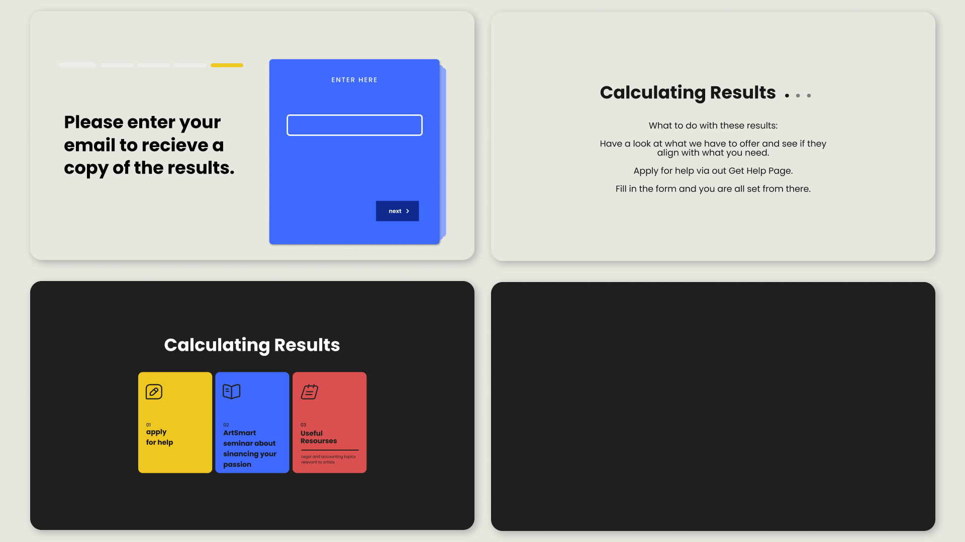
SOLUTION: A quick survey that allows for a personalised user experience
The use of the questionnaire bot allows users that do not know what they want to get out of their experience on the website and guides them to the results that match their answers. Hence, this boosts users' confidence while navigating around the space.

CONCLUSION
Objectives ✅
Strategy ✅
